Feel free to flame me if I’m too far off track.
I’m using Python-Markdown - admonition extension but there is no CSS included as part of this extension.
Would someone give me some guidance how to style the following code. This includes the code and where to put it.
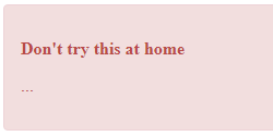
!!! danger highlight blink "Don't try this at home"
    ...
will render:
<div class="admonition danger highlight blink">
<p class="admonition-title">Don't try this at home</p>
<p>...</p>
</div>
I’m looking for something similar to what is rendered in MkDocs:
Danger: would suffice instead of the lightning icon (I wasn’t aware css could insert text) but I’d like a different style for the admonition-title, and a different one again for the paragraph.
vas
July 10, 2020, 6:07pm
2
You should look at the CSS for MkDocs.
1 Like
Thank you. As a noob I’m pretty happy with the start:
I still don’t understand how to get the admonition-title (danger) in the output from the stylesheet.
Given the html is autogenerated there must be some way of getting it to use stylesheet.css.
Output:
The CSS code in my system is incredibly complicated but by looking at mkdocs/mkdocs/themes/mkdocs/css/base.css at master · mkdocs/mkdocs · GitHub I saved the following code to a file following a guide:
stylesheet.css
.admonition {
    padding: 15px;
    margin-bottom: 20px;
    border: 1px solid transparent;
    border-radius: 4px;
    text-align: left;
}

.admonition.note { /* csslint allow: adjoining-classes */
    color: #3a87ad;
    background-color: #d9edf7;
    border-color: #bce8f1;
}

.admonition.warning { /* csslint allow: adjoining-classes */
    color: #c09853;
    background-color: #fcf8e3;
    border-color: #fbeed5;
}

.admonition.danger { /* csslint allow: adjoining-classes */
    color: #b94a48;
    background-color: #f2dede;
    border-color: #eed3d7;
}

.admonition-title {
    font-weight: bold;
    text-align: left;
}
I’ve narrowed it down to the link and article elements:
<!DOCTYPE html>
<html lang="en" class="no-js">

<head>
    <link rel="stylesheet" href="assets/stylesheets/main.6e35a1a6.min.css" />
</head>

<body>
    <article class="md-content__inner md-typeset">

        <div class="admonition danger highlight blink">
        <p class="admonition-title">Don't try this at home</p>
        <p>...</p>
        </div>
        <p>Following paragraph.</p>

    </article>
</body>

</html>
There is about 4000 lines of CSS but I can see in developer tools there is aonly about 100 lines used. How do I narrow it down to the key bits?
Well it’s pretty unremarkable. Basically, there is a placeholder for supported admonition icons.
Probably much more difficult with labels.
lmmx
May 9, 2024, 10:31pm
5
I asked ChatGPT to take a shot at it and then edited it (it added overflow: hidden which put the ::before element out of view):
.admonition {
    padding: 15px 20px;
    margin-bottom: 20px;
    border: 1px solid transparent;
    border-radius: 4px;
    box-shadow: 0 1px 1px rgba(0,0,0,0.05);
    position: relative;
    line-height: 1.4;
}


.admonition::before {
    margin-left: -5rem;
}

.admonition.note {
    color: #31708f;
    background-color: #d9edf7;
    border-left: 5px solid #31708f;
}

.admonition.warning {
    color: #8a6d3b;
    background-color: #fcf8e3;
    border-left: 5px solid #8a6d3b;
}

.admonition.danger {
    color: #a94442;
    background-color: #f2dede;
    border-left: 5px solid #a94442;
}

.admonition-title {
    font-weight: bold;
    margin-bottom: 10px;
}
lmmx
May 10, 2024, 12:11am
6
I developed this a bit more to make it look even more like mkdocs:
.admonition{
        padding: 15px 20px;
        padding-bottom: 0 !important;
        margin-bottom: 20px;
        border: 1px solid #448aff;
        border-radius: 4px;
        box-shadow: 0 0.2rem 0.5rem #0000000d,0 0 0.05rem #0000001a;
        color: #222222;
}
.admonition::before {
        position: absolute;
        margin-left: 0;
        margin-top: -5px;
}
.admonition-title {
        font-weight: bold;
        padding: 10px 20px;
        padding-left: 6rem;
        margin: -15px -20px 0 -20px;
        border-radius: 4px 4px 0 0;
}
.admonition-title + * {
        margin-top: 15px;
}
.admonition-title a {
        color: green;
}

/* Danger/warning (orange) */

.admonition.danger::before, .admonition.warning::before {
        content: "⚠️";
        color: darkorange;
}
.admonition.danger, .admonition.warning{
        border-color: #ff9800;
}
.admonition.danger .admonition-title, .admonition.warning .admonition-title {
        background-color: #ffe0b2;
}

/* Important (green) */

.admonition.important::before {
        content: "❗";
        color: green;
        filter: sepia(1) saturate(5)  hue-rotate(90deg);
}
.admonition.important{
        border-color: #4caf50;
}
.admonition.important .admonition-title {
        background-color: #c8e6c9;
}

/* Note (blue) */

.admonition.note::before {
        content: "✏️";
        color: royalblue;
        filter: sepia(1) saturate(3) hue-rotate(180deg);
}
.admonition.note {
        border-color: #00b8d4;
}
.admonition.note .admonition-title {
        background-color: #d9edf7;
}

/* Tip (gold) */

.admonition.tip::before {
        content: "💡";
        color: goldenrod;
        filter: sepia(50%) saturate(3) hue-rotate(-10deg);
}
.admonition.tip{
        border-color: #ffc107;
}
.admonition.tip .admonition-title {
        background-color: #ffecb3;
}


