Esteban has generously contributed several rounds of feedback and bug fixes that @jgm and I have provided. Now it’s our turn to take over, fork the code, and make further improvements. So I have forked it at:
I’ll be making whatever copy and code changes are needed. So please, take a look, and let us know what you think can be improved or changed in advance of moving this to the commonmark.org domain as an “official” help, tutorial and reference page!
This looks like a good tutorial. I recommend the following changes:
Remove Github/Reddit tabs from the front page and any other references to non-CommonMark flavours of Markdown throughout the tutorial.
The mystery meat navigation on the right hand side is confusing. Show the link titles at all times, not just when the cursor hovers over the link. (also check that other aspects of the tutorial work well on devices where you can’t hover over page elements).
As with the above issue, explicitly label the slide tabs along the bottom (less of an issue though).
Separate out core CommonMark tutorials from extension tutorials (such as on the tutorial on tables). Perhaps just remove the extension tutorials for the time being?
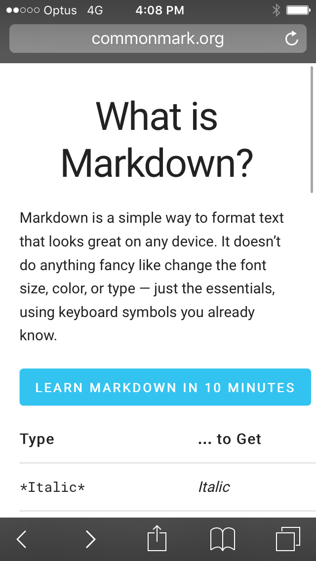
The site appears to be responsive, but only to a point. Make the tutorial layout look good on mobile devices.
I think instead of removing them entirely, you might want to make them links that lead offsite to the tabs on The Markdown Tutorial . While I agree learn.commonmark.org should focus on commonmark specifically, I think the reference to other markdown flavors is still useful, at least while those flavors are still commonly used.
At first I didn’t see the “Start” button, or more likely unconsciously assumed it would you scroll down to the “Reference” section. So, I propose to rename the “Start” button to “Start interactive tutorial” and make it larger or more padding…
In the tutorial: make the images at least .svgs and choose a font that’s not as stretched and it should be a monospace font. Or better yet, instead of using images use accessible html text that can be copied, marked to see where are how many spaces etc.
Lots of work to do, I wish I had noticed @eh3rrera used images for the background elements but overall, it’s great and I will fold in the above advice.
(and I want to strip all the Reddit and GH references, it’s just too much for a tutorial to teach all that plus site-specific flavors…)
Ok, the main page is much better now, simpler, clearer. I have a lot of work to do on the exercises but I am happy with the essential reference page.
I should probably have a “learn more…” link at the very bottom of the main help page for people that want an exhaustive reference. Right now it’s three main things:
The TL;DR 140 character Twitter explanation of “What the heck is Markdown”
Link to 10 minute interactive tutorial for people that want to learn it right now in their browser.
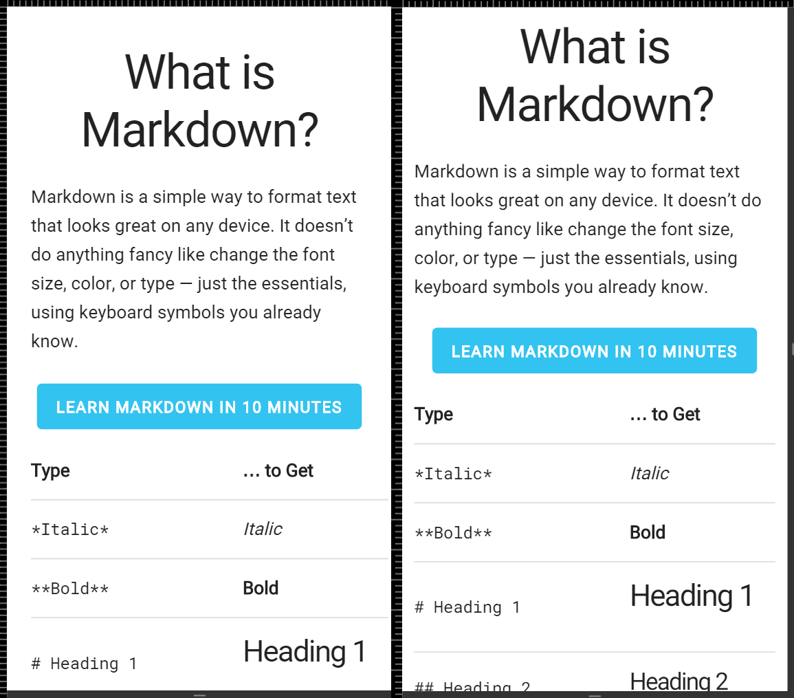
A quick reference card with the essentials for people who want to scan it for 60 seconds and get the general idea of how Markdown basically works.
(not there yet) more depth at the bottom of the reference card for people who reach the end and want even more detail than the quick reference card can provide.
Ok I added more links at the bottom of the page leading to extra detail of various kinds. Not quite sure how to work in your texts @chrisalley.
I also made sure the reference table works on mobile, pretty clean solution, just suppress the middle “second example” column in the table, switching it from 3 columns to 2. That looks good on my iPhone 6+ and seems OK in the Chrome mobile emulator for smaller devices.
Strikethrough’s gone but that left broken links in navigation (both menu and next/prev).
Menu rendering on mobile Chrome is buggy (at least on my Android 5.1): parts of the page show on top and bottom of screen, trying to scroll the menu randomly scrolls the page etc.
I fixed the missing navigation issue between the lessons, but I still haven’t decided on the final structure. We may add or remove some lessons in there, or steps in the lessons, as we go.
I made the lesson numbers proper HTML/CSS elements rather than images.
I am torn on making the lesson intro text example, with the superimposed red + symbols, HTML – I think I’ll be in alignment hell if I do that, as trying to get those red + symbols to be in the exact right place will depend on the proper font and rendering in the browser. I’m thinking I’ll just re-render the text at a much higher resolution in Roboto Monospace. I may give it a shot, just because rendering text as images is such a PITA and makes the lessons harder to change, edit, and improve.
It does seem like a proper intro for each lesson section takes the form of:
Here’s what we want to do (make something bold or italic)
Here’s the particular keyboard characters we will use (* and _)
And the individual tasks within each lesson should be of the general form
Super simple example (make this word bold)
Slightly more complex example (make this word bold and that word italic)
Full complexity example (make words both bold and italic at the same time)
Playtime, which will mention the special cases (how do you escape an asterisk, etc)
Would it be possible to make the content width resize on mobile based on the screen width? As you can see in this screenshot, the right padding is a bit off.
Would it be possible to bottom-dock the tooltips for mobile users? Requiring a tap on the screen’s top to close a tooltip opened by a tap on the screen’s bottom doesn’t seem very friendly.
Now, make the scrollbars autohide, and it’s perfect
 but overall, it’s great and I will fold in the above advice.
 but that left broken links in navigation (both menu and next/prev).