Oh, I like this character technique – I can use it to indicate spaces in the CommonMark reference!
Oh, I like this character technique – I can use it to indicate spaces in the CommonMark reference!
Nice, isn’t it ![]() – Good that most browsers seem to have a glyph for it somewhere!
– Good that most browsers seem to have a glyph for it somewhere!
[ The U+23B5 BOTTOM SQUARE BRACKET character is now a permanent bookmark in my installation of the fabulous BabelMap application … ]
[ Edit: JFYI, a glyph for that bracket is, probably among many others, in the fonts FreeMono, FreeSans, and in Cambria Math and Segoe UI Symbol provided with Windows. Says BabelMap. ]
[ Edit 2: Aaaaah, wait! It looks like U+23B5 “⎵” is the wrong bracket, and one should use U+2423 OPEN BOX “␣” instead! The latter has, indeed, “graphic for space” in it’s official description. — So that’s why this looked so wrong all the time, obvious difference! ![]() ]
]
Some other good options here
I prefer the one you used, as the “true” space bracket is really tiny!
Representing spaces is hard:
◌◌◌◌code block
⎵⎵⎵⎵code block
␣␣␣␣code block
░░░░code block
␠␠␠␠code block
I think any symbol that doesn’t make it clear how many spaces, is kind of a fail right out of the gate.
1 Like
Wow, I think I got me a new hobby ![]() – To nitpick, searching a symbol for the “space bar” on the keyboard is one more, new, interesting quest, as it is certainly not equivalent to a symbol for the “space character” in a string …
– To nitpick, searching a symbol for the “space bar” on the keyboard is one more, new, interesting quest, as it is certainly not equivalent to a symbol for the “space character” in a string …
From the list which reads kind-of “official”, given over there:
- U+00B7 “
·” Middle dot - U+237D “
⍽” Shouldered open box - U+2420 “
␠” Symbol for space - U+2422 “
␢” Blank symbol - U+2423 “
␣” Open box
(and I would add the symbol that looks like U+25B3 “△” WHITE UP-POINTING TRIANGLE, used in ISO 6093:1985 for example, if that’s not GREEK CAPITAL LETTER DELTA), I have to say:
I like
- “
␣” OPEN BOX the best, and then - “
△”, this triangle-thingy, and then - “
·” MIDDLE DOT on third place.
(The BLANK SYMBOL reminds me of punched cards, the SYMBOL FOR SPACE treats poor U+0032 as if it were a control character, the SHOULDERED OPEN BOX is completely new to me, and from the description “graphics for keyboard symbol for no break space” it is not what we look for anyway, and finally MIDDLE DOT is at least in ISO 8859-1).
But what really bothers me is the fact that U+2423 OPEN BOX is, on the system I’m sitting at right now, “only” available in the fonts:
- DejaVu Sans
- DejaVu Sans Mono
- DejaVu Serif
- FreeMono
- FreeSans
- FreeSerif
- Linux Biolinum G
- Linux Libertine Display G
- Linux Libertine G
- Lucida Sans Unicode
- Meiryo
- Meiryo UI
- MS Gothic
- MS Mincho
- MS PGothic
- MS PMincho
- MS UI Gothic
- Segoe UI Symbol
but not in my preferred monospace font in the browser, Cousine, and that I therefore have no idea where the “␣” I’m looking at is actually coming from, but I think I can see that this one has the wrong metrics and does not match Cousine’s monospace pitch …
Eeeeehm, what was the question again??? ![]()
[ Edit:
I prefer the one you used, as the “true” space bracket is really tiny!
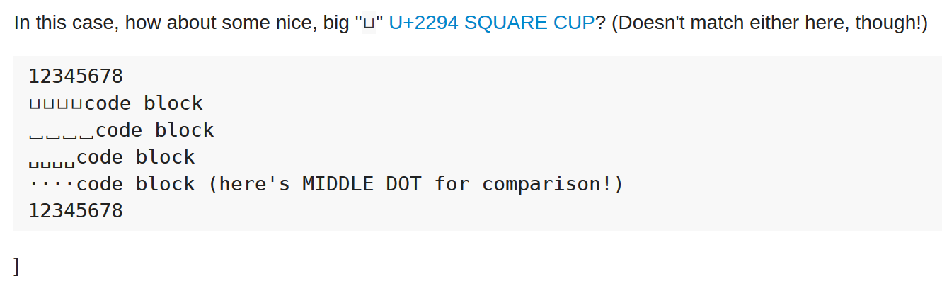
In this case, how about some nice, big “⊔” U+2294 SQUARE CUP? (Doesn’t match either here, though!)
12345678
⊔⊔⊔⊔code block
⎵⎵⎵⎵code block
␣␣␣␣code block
····code block (here's MIDDLE DOT for comparison!)
12345678
]
[ Edit 2:
Switching to DejaVu Sans Mono as the browser’s monospace font solves the font metrics problem, as you can see in this screenshot: MIDDLE DOT and OPEN BOX match the font’s pitch, but SQUARE CUP and let alone BOTTOM SQUARE BRACKET don’t:
]
Uh oh, the preferred space character
U+23B5 BOTTOM SQUARE BRACKET
Does not render at all in iOS ![]()
Most other stuff here does, but it highlights the difficulty of choosing obscure Unicode to represent space characters… I am kind of liking
␠␠␠␠code block
␣␣␣␣code block
So U+2423 OPEN BOX is somewhere in the built-in fonts of iOS?
Judging by the long list of fonts providing OPEN BOX compared to the meager four with BOTTOM SQUARE BRACKET, and the Unicode hint that OPEN BOX is meant to be a “graphic for space” character: I tend to the conclusion that U+2423 OPEN BOX is the most appropriate and practical choice to represent SPACE in technical texts (although I wouldn’t mind MIDDLE DOT at all, either).
And the OPEN BOX character in DejaVu Sans Mono, seen in the screenshot, looks very different (much more noticeable, if that’s the word) from the one my browser chose to employ when Cousine was/is the monospace font in the front row, from whatever font that came—so choosing a good monospace font with a nice, matching OPEN BOX could make a difference?
The SYMBOL FOR SPACE character would be better if it were actually a symbol. Now if only there were a symbol that would accurately represent a space…
Oh wait, I’ve found one!
⎵
Seems like a missed opportunity in font design. Oh well, so long as it’s not confused with the CYMBALS IN SPACE character.
That’s why I didn’t use it in the spec. I used · instead.
2 Likes
It is certainly the traditional coding environment “reveal white space” indicator for a space which is definitely a point in its favor, but not totally sure how average non-coders will react to it.
1 Like
Middle dot is the only one of these that feels completely natural to me.
I’m pretty sure I remember my Mom revealing spaces as dots alongside the backward P paragraph thingy symbol when I was a kid and she used to do freelance copy editing from home.
I also asked my wife for her opinion doing my best to avoid leading questions. As a fine artist who usually works with oil on canvas I think she qualifies as a non-coder.
First I asked her what kind of character or symbol she would use to represent a space if it had to be something othet than whitespace and she replied “a period.”
Then I showed her the examples above.
She thought the underbracket thingy and the middle dot both make sense.
My vote is for middle dot.
1 Like
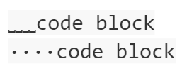
I like the underbar as a “space indicator”, but it’s really small! And the wider version fails to render on iOS so that’s a non-starter.
␣␣␣␣code block
····code block
Do you guys remember the 2012 myspace logo redesign? ![]()
![]()
Guess what word goes there?
Unfortunately that style, though I do think it is a bit better, doesn’t render well even on my relatively high DPI monitors, it’d probably be disastrous on a low-res display:
So I think we’ll go with the classic centered dot and match the spec.
1 Like
If the last screenshot shows how you see U+2423, then yes: thats really, really, really small.
You can’t use a monospace font which includes a glyph for U+2423? Have you tried DejaVu Sans Mono, for example?
Anyway—MIDDLE DOT is certainly the most widely available of all the candidates here.
1 Like
Well, as far as the docs at http://commonmark.org/help go, per the CSS and HTML on that page, it’s Google’s open source Roboto font, freely available on the web, feel free to look it up. It is the monospace variant, but exact same family, so Roboto Mono.
Here the font stack (for a code block) is
font-family: Consolas, Menlo, Monaco, "Lucida Console", "Liberation Mono", "DejaVu Sans Mono", "Bitstream Vera Sans Mono", "Courier New", monospace;
Which, on my machine, would be Consolas. Using Google/Roboto is easier since every browser can download and use the same font, at the cost of some network transfer delay, versus the “native” OS fonts.
Hmm, I can’t find OPEN BOX in the Roboto Mono glyph map at Google: this looks like Latin, Greek, and Cyrillic alphabets, but not many “technical” symbols.
I’m really no expert, but if the browser can’t find a definition for U+2423 in the “declared” font (that would be Roboto Mono?), it is my understanding that any font is preferred over no glyph at all, but which font is actually chosen for OPEN BOX in this case is more or less arbitrary.
Pasting OPEN BOX characters into GVim yields proper glyphs only when DejaVu Sans Mono is in use, not with Consolas, not with Lucida Console nor Courier New.
And DejaVu Sans Mono definitely has an OPEN BOX glyph (in the lower part of the table, below the mathematical binary operators and relations). I have no clue about “web fonts”, and how to reliably ship web pages using a such fonts, but on the same fontsquirrel page there’s also a so-called “Webfont Kit” for download, which sounds remotely helpful; if you’re really bored, it could be worth a try …
Would it be overkill to make a custom font for the SYMBOL FOR SPACE character and include it for that unicode range only so that the character looks exactly how you want it to look for all browsers?
At that point you could just use <img, but the small circular dot seems quite well represented across fonts and OSes. That’s what is in the help now, and in the spec.
1 Like
@zzzzBov: In my opinion, it would be overkill to make a custom font for an existing Unicode character with a glyph for it that is provided in several freely available fonts (like DejaVu Sans Mono from the DejaVu font family). Note that you can’t provide the “SYMBOL FOR SPACE” alone in the custom-made font, as it has to match (visually and metrically) all the other glyphs used in code examples, which means at least the ISO 646 repertoire …
In particular, distributing web pages and documents using this custom-made font is likely to be more complicated than content using a popular, freely available font (maybe hosted at Google Fonts or FontSquirrel).
@codinghorror: Except that you can’t use <img> in code spans or code blocks, of course. And pasting whole code examples (as <img> elements) into the text would certainly not be an improvement, IMO!
[…] the small circular dot seems quite well represented across fonts and OSes.
The well-entrenched small circular dot is the U+00B7 MIDDLE DOT “·” from the Latin-1 Supplement block (aka “right half” of ISO 8859-1), I suppose? Or did you find an even nicer, more circular (?) dot? ![]()
I agree that MIDDLE DOT is a quite reasonable choice, being both “universally available” and “universally understood”.
From the spec:
In the examples, the
→character is used to represent tabs.
Wouldn’t U+21E5 ⇥ make more sense?
It may look worse and therefore U+2192 → could still be the character to prefer.
Hi all,
I’m chiming in late here to say that the best symbol for a space is no symbol at all. Text descriptors are much clearer, more reliable and universal than any symbol anyone could come up with.
In the software industry we’ve wrung our hands and burned our money for many years coming up with icons and symbols we hope users will understand, but the lesson we’ve learned after all that is that nothing beats text. There will be a huge segment of users who will not realize that ⎵ represents a blank space. Something like [space] or [sp] is much clearer. As noted above, there is the Unicode symbol that renders the letters SP like so: ␠ (U+2420)
As you can see, it’s rather small. And sometimes it renders diagonally, so it’s inconsistent – see bottom of this post (horizontal vs. diagonal is presumably the typeface designer’s decision.) Right now the CM spec page doesn’t specify a font for the code blocks, just the monospace type, so what each visitor will see depends entirely on what they’ve set as their default monospace font in browser font settings.
And since most fonts, monospace or otherwise, don’t include U+2420, plain text like [space] or [sp] is safer.
Note also that the middle dot currently used in the spec to represent a space is remarkably faint, almost invisible. I’m not sure why. I tried it in Chrome, Firefox, and Edge, with Inconsolata, Liberation Mono, Linux Libertine Mono, and Source Code Pro – it seems to make no difference.

Don’t use nescior crap.
Tell that to all of these nations: Interpunct - Wikipedia.
In formatted text I prefer a grey rectangle. In a grey code block this could be a white rectangle. (However the developers will need to catch up.) In plain text I like the open box ␣ or the blank keycap ⃣ if it’d only format correctly. When those fail, APL quad ⎕, white vertical rectangle ▯, or white square □ (whoa, that’s tiny).
1 Like