Hi all – The spec uses a middle dot character (U+00B7) to represent a blank space (U+0020). For reasons I don’t understand, this middle dot is nearly invisible on my system, and presumably others’ systems. See screenshot at bottom of this post.
I’ve tried it in Chrome 49, Edge 25.1xx, and Firefox 45, and with Inconsolata, Linux Libertine Mono, Liberation Mono, and Adobe’s Source Code Pro to no avail – the fonts seem to make no difference. (The spec page doesn’t specify a font for the code blocks – it just specifies a monospace type, which means the browser will use whichever monospace font the user has specified in the browser font settings. Note that Edge doesn’t have font settings yet, so all the fonts I tried were in Chrome and Firefox – I don’t know what font Edge is using for monospace.)
The screenshot is from Firefox. This issue is related to this thread about how to represent spaces, and the thread I opened yesterday on clearly explaining in the spec how whitespace characters are represented. For what it’s worth, I had no idea that the middle dots represented spaces when I first read the spec, or that the unblocked arrow meant TAB. Text is massively superior to graphical symbols for such purposes, and friendlier to people from other cultures, countries, etc. (there’s no way to translate a symbol, and they’re difficult to google.)
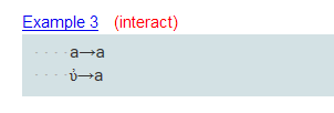
If you’re having trouble seeing them, there are four middle dots at the start of the lines below.
It’s meant to be nearly invisible: the idea is that it should still look like a space, but it should be possible for readers to count how many spaces there are.
Note also that if you copy/paste from the code samples, you get actual spaces, which is also desirable. The dot is inserted with CSS.
Perhaps we could use a bigger dot? Or specify a particular font?
Text is massively superior to graphical symbols for such purposes, and friendlier to people from other cultures, countries, etc.
Ah, that explains why I had trouble identifying which Unicode middle dot character it was (there are several, bullet operator, etc.) I was pasting a blank space without realizing it.
No, I’m not suggesting something like <TAB>. Angle brackets in the examples would be confusing since they look like HTML/XML markup.
Is there a standard for how characters or keys are described textually? I think square brackets might be in use in various settings. Another option is to use the code backticks, like we see in the Atom text editor Flight Manual. Basically, I think the way people normally express something like CTRL-ALT-DELETE is the way to go, so SPACE and TAB might work, or [SPACE] and [TAB] (or [SPACE] and [TAB].